Since I have changed my topic to mapping live music venues/halls in New York City I have spent some time doing research on the different kinds of maps associated with this topic.
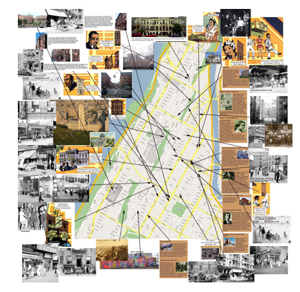
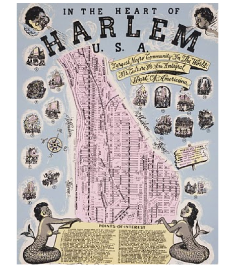
I came across a group of maps called, The Harlem Renaissance Maps (http://nashamapa.com/2010/04/09/harlem-renaissance-maps/), which used a variation of mapping styles in order to show what types of music was happening in Harlem, where it was going on and who was playing. These maps use a variety of features including pictures, arrows, popups, street maps etc in order to depict the “scene” at the time. These maps are very colourful, the types are unique and some are more informative than others but I have really enjoyed reading them and seeing how they came about.

I stumbled upon a few newer music mapping projects that also had varying techniques and goals.
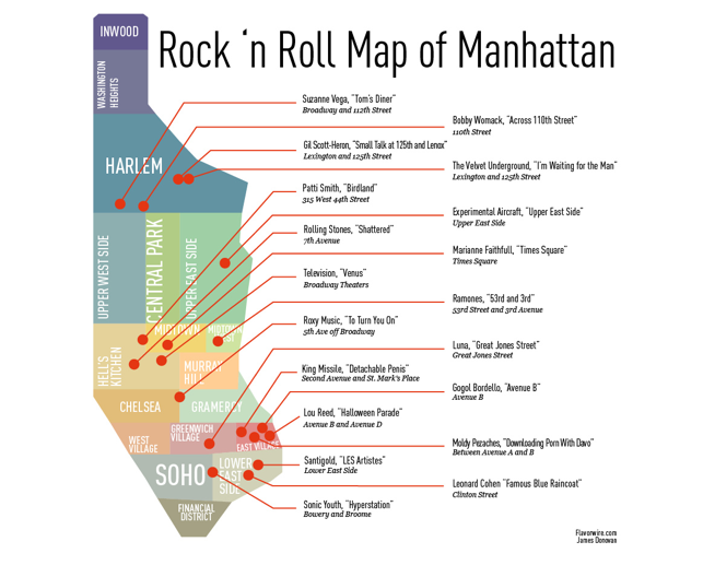
First comes this map which was modelled to map Rock ‘n Roll in Manhattan:
This excerpt accompanied the post where I found the map:
“A musical topography like this requires relatively precise references – out goes Sinatra’s New York,who remains vague as to exactly where he wants to be “part of it”. That precision enables the pinpointing of artistic hotspots. The lyrical references by Sonic Youth, Leonard Cohen and Santigold on this map are relatively isolated in SoHo and the Lower East Side; the East Village boasts four references on a much smaller surface.” http://bigthink.com/ideas/37706?page=1
I think this evaluation is quite accurate and what I hope to avoid when I collect my data and input it into URT.
The final two projects I have looked at so far seemed the most modern in terms of using technology in order to pinpoint precise locations and present data in unique formats.
This project is called New York Mapping. Here, researcher Mark Edward Campos, investigates the context around a site with the goal of helping to understand the goings on, in a 24-hour timeframe of an area in New York City.
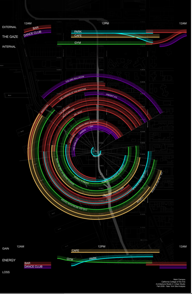
(to view the map in full please go to http://datavisualization.ch/showcases/sound-mapping-in-new-york-city/)
An explanation of the map:
The center of the graphic is the site Mark and his colleagues investigated. The circular strokes are the times that businesses are open over a 24 hour period. They are color-coded by type (cafe, bar, dance club, park and gym), and the distance from the center shows their real planar distance from the researched site. The length of each stroke represents the time that each business is open daily, on an implied 24-hour clock, with midnight at the top of the circle and noon at the bottom.
The last project resembles most closely to my original thought process in choosing to map music in New York City.
Chris McIntyre, a New York composer/performer/curator, attempted to create a Google Map to chart the active music venues in the 5 boroughs of NYC.

http://cmcintyre.com/blog/nyc-music-venues-google-map-project
This map is accompanied by Chris’s reasoning behind this map project:
“Being a musician who flows well outside the mainstream, the majority of the venues I initially included were “underground” and tended toward experimentalism. I eventually started to include major mainstream classical and otherwise venues as the number of map views increased which now totals an amazing 5400″ (McIntyre).
———————————————————————————————-
I think all of these maps attempt to portray music in the city in varying lights. They use different techniques in order to communicate different points. It is clear that as time goes on some qualities endure, such as using the base map of Manhattan as the main reference source, while others become less visible. All seem to accomplish the idea of mapping a type of music however its interesting to see which maps seem to be exhaustive in terms of claiming to include ALL of the data on their specific subject (the Harlem Maps) and those which are obviously missing some pivotal or more precise data (Rock ‘n Roll Map).
At this point I plan on narrowing down my research. I need to decide what variables I want to include in my data…whether to focus on a particular borough, venue size, type of music, data range and time period. Once I narrow down this information I can start to focus on data collection.
The New York Mapping project is quite intriguing — probably in large part because it’s also visually striking. I played around with it for a bit — but, try as I might, I simply couldn’t figure out how to make sense of it! I don’t get the “gaze” and “energy” dimensions. You noted that some of these maps aren’t explicit in their use of Manhattan as the base map. This particular “map” (actually a hybrid map/dataviz) represents geographic relationships in a very different way than the other maps you show in this post. Here, the spatial dimensions of the map aren’t intended to be an “analogue” for geographic relationships; instead, they reference both space and time. The distance of each ring from the center represents the distance of the site from the High Line (why the High Line is at the center, I have no idea). And the length of each ring segment represents a temporal dimension.
All this makes me wonder how intuitive this “mapping” is — and whether it “maps” anything terribly useful.
I agree with you. I found it difficult to understand in terms of what it is necessarily trying to communicate, yet intriguing with regards to how it is presented visually.