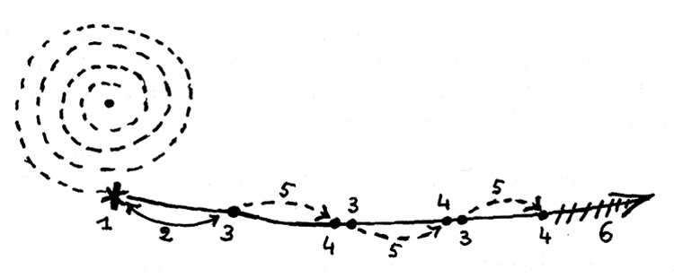
How much should we expect our plotted data to “speak for themselves”? How much framing and context do we need to provide? What combination of modalities allows us to most effectively make our “spatial arguments”?
- Consider the rhetoric of the diagram and the data visualization (see also Tufte)
- Consider the map and the timeline (see also Theibault)
- What “genres” can be utilized to make multimodal arguments? (see also Ball)
- What genres/modes/rhetorics were employed in the multimodal projects we explored at the beginning of the semester?
After considering our individual arguments, let’s think collectively. What synergies exist between our projects? How do we find overlaps, and what’s their significance? What’s the nature of those overlaps — shared topic, shared method, shared mode of representation, etc.? What macro-scale arguments can we make that bridge our individual projects? In short, what added value can we draw from plotting all of our individual projects on the same map?

